
Mobile optimisation is essential for businesses to succeed in the digital age. Brands should leverage this trend by recruiting the services of a web design agency. Their expertise in mobile-first responsive design, development, and user behaviour enables them to improve usability, streamline mobile navigation and interfaces, enhance performance, speed, and accessibility and allow content to adapt seamlessly to various screen sizes. With their skills and knowledge, web designers can create user-centric designs that boost engagement, reduce bounce rates, and improve overall conversions, ensuring a seamless mobile browsing experience.
As mobile technology continues to improve and increase in availability, so does the number and frequency of people browsing the internet on smartphones or tablets, thanks to their convenience, portability, and versatility. Brands should take advantage of this trend by hiring the services of a web design firm to optimise their sites for the mobile experience.
What is Mobile Optimisation?
Mobile optimisation is the process of making a website that’s easy to use on mobile. Website optimisation for mobile devices involves creating a site that can adapt to any screen size, resolution, and orientation, ensuring that it looks and functions well on both mobile and desktop.
What is the Importance of Mobile Optimisation?
Nearly 50% of global website traffic comes from mobile devices, making mobile site optimisation a critical factor in modern marketing. It ensures that a website delivers an optimal user experience across all screen sizes, particularly on smartphones and tablets. In turn, this will enable brands to enhance their digital presence, improve customer satisfaction, and maximise their online success in an increasingly mobile-driven world.
Does Mobile Optimisation Affect SEO?
Yes, mobile optimisation plays a significant role in search engine optimisation (SEO). Search engines like Google prioritise a site’s user experience viewing on mobile. Thus, by optimising for mobile, you can improve your site’s visibility, rankings, and overall online performance.
How Will Mobile Website Optimisation Services Help You Create a User-Friendly Experience?
Hiring a web design service that offers responsive web design will help turn your website into a mobile-friendly user experience. Here are the six ways such services can help:
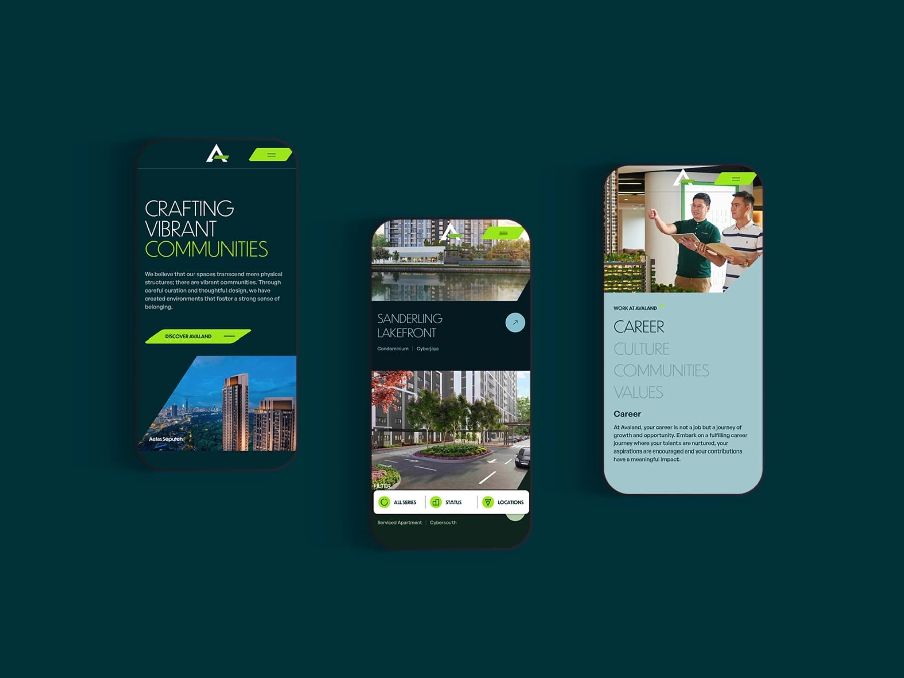
1. Ensuring Responsive Web Design
Responsive design is an approach used by web designers to create websites that adapt seamlessly to mobile devices, providing optimal user experience and making it easier to view and interact with.
Common responsive design methods utilised by web design agencies include using a fluid grid, optimising for touchscreens, setting appropriate responsive breakpoints, and setting up a viewport meta tag.
Mobile responsive website design offers benefits such as broadening your brand’s reach, boosting loading speeds, and lowering maintenance needs. These benefits result in improved SEO rankings, higher conversion rates, and an overall better, more consistent user experience.
2. Enhanced Website Speed and Performance
Page speed is a critical element in mobile browsing, directly influencing user experience, retention, and search engine rankings. Users expect web pages to load instantly, and even a few seconds of delay can result in higher bounce rates and lost opportunities.
Some techniques web designers use to improve page loading speed include:
- Image compression: Compressing them without compromising quality, reducing file sizes to improve load times. Web designers use modern formats like WebP, which are lighter than traditional formats like JPEG or PNG.
- Lazy loading: Ensures that images, videos, and other content are loaded only when they come into the user’s view, reducing initial load times and ensuring that top-page content gets priority.
- Optimised coding: Agencies streamline code by minimising JavaScript, CSS, and HTML files, using techniques such as code minification and removing unnecessary elements to enhance efficiency.
- Caching strategies: Browser caching allows mobile devices to store static assets, such as logos and stylesheets, locally. This reduces the need for reloading them on subsequent visits.
- Content Delivery Network (CDN): CDNs distribute website content across multiple servers worldwide, ensuring faster load times by serving content from the nearest server to the user’s location.
3. Prioritises Mobile-Friendly User Experience (UX)
Mobile-first design is an approach to web design that prioritises the mobile user experience before scaling up to larger devices like desktops. Instead of retrofitting an existing site for smaller screens, mobile-first web design begins with the constraints of and needs of mobile devices, ensuring optimal functionality and usability from the outset.
4. Enhancing Mobile Navigation
One of the unique difficulties of navigating on mobile devices is the smaller screen; the limited real estate can lead to clutter that makes navigation harder, reduces readability and slows down page loading speeds.
Web design agencies tackle these challenges by creating responsive navigation features such as:
- Hamburger menus: The hamburger menu condenses navigation into an icon, revealing a full menu only when tapped.
- Intuitive buttons: Large, touch-friendly buttons with ample spacing reduce accidental clicks.
- Sticky navigation bars: These remain visible as users scroll, ensuring easy access to key menu items.
5. Mobile Search Engine Optimisation (SEO)
Mobile-specific SEO is a crucial factor in higher search engine rankings. A web design firm can ensure your website is fully optimised for mobile SEO by focusing on:
- Page speed: Faster sites are more visible to search engines.
- Mobile responsive design: Ensuring enhanced user experience.
- Optimised titles and meta descriptions: Creating short but informative metadata for mobile users.
Key Takeaways
Web design agencies are essential to your brand’s success in the digital landscape. They understand the importance of mobile optimisation and leverage their expertise to create an online experience that appeals to mobile users.
Ready to upscale your mobile presence?
Let BikeBear handle all of your mobile optimisation needs! As Malaysia's leading website design agency, BikeBear has the expertise to optimise your website for a seamless mobile experience.


